🎉 Try out the new blocks editor 2020-11-10

Simplifying Design: Moving Invisible Components to Blocks

Today we’re inviting you to try out our new slimmed down Design Tab and the enhanced Blocks Editor that goes along with it!

At Thunkable our mission is to make cross platform app development as simple and as accessible as possible. We’ve come a long way and we have no plans on stopping any time soon. This is the first in a series of exciting updates planned for the platform which we hope you’ll love just as much as we do. Please leave your feedback here to let us know what you think of this latest beta feature.

The most frequent question we get from users is “How do I design my app?”. Did you know there are currently 58 components in our Design Tab? Every time a new project is created Thunkers need to sift through 31 “invisible” components (which don’t require “designing” at all!) to find the UI elements they actually need. Think back to when you were new to Thunkable - more than half of the components in the Design Tab are “invisible”. This made finding the right component slower and more difficult than it needed to be, so we’re making it better. The search bar is great - when you know what you’re searching for - but as a brand new user you still don’t know what anything does yet, so we’re reducing the cognitive overhead by moving the invisible components to the Blocks editor. By making the Invisible components available in the Blocks editor you’ll be able to configure the set up and the logic of these component all at the same time.

Try it Out

Today we’re inviting you to try out our new slimmed down Design Tab and the enhanced Blocks Tab that goes along with it! Simply opt in here: Thunkable

Once you have opted-in you will now have just 27 visible UI components to choose from (much easier to deal with than 58, right?)

  1. Button
  2. Label
  3. Image
  4. Text Input
  5. List Viewer
  6. Web Viewer
  7. Switch
  8. Slider
  9. Map
  10. Animation
  11. Video
  12. Canvas
  13. Loading Icon
  14. Date Input
  15. Time Input
  16. PDF Reader
  17. Data Viewer List
  18. Data Viewer Grid
  19. Rating
  20. AdMob Banner
  21. Top Tab Navigator
  22. Bottom Tab Navigator
  23. Stack Navigator
  24. Drawer Navigator
  25. Screen
  26. Row
  27. Column

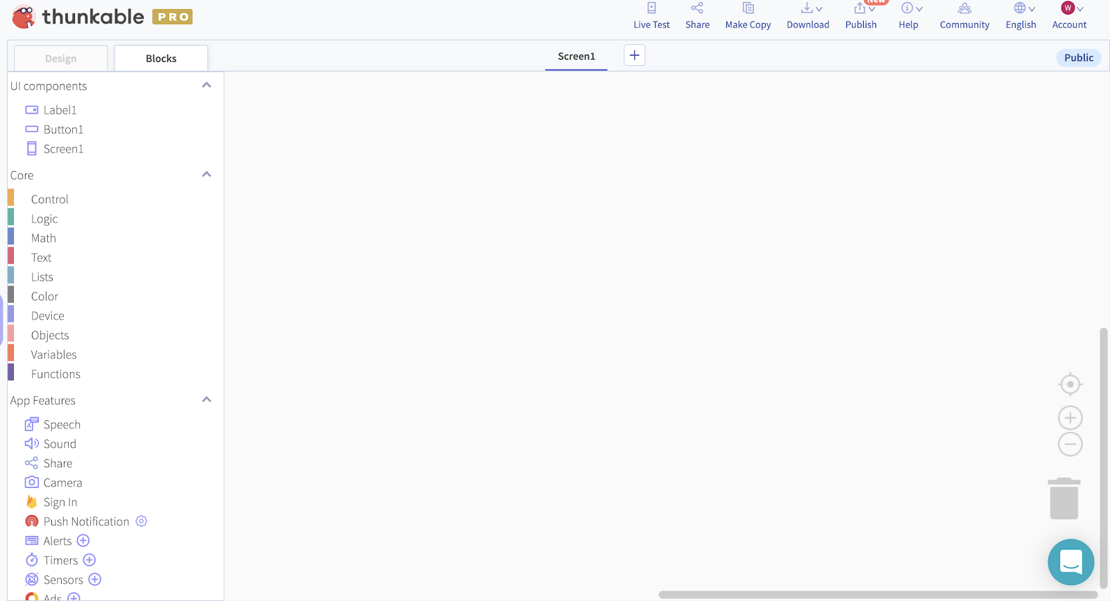
The biggest change is in the Blocks Tab. There are now 4 categories on the left of the screen; UI components, Core, App Features and Advanced (which included the “Any Component” blocks). To improve navigation each category is expandable and collapsible.

Beyond that, the blocks themselves have been improved to make them easier to understand and more intuitive to use. Take our classic translator app as an example.

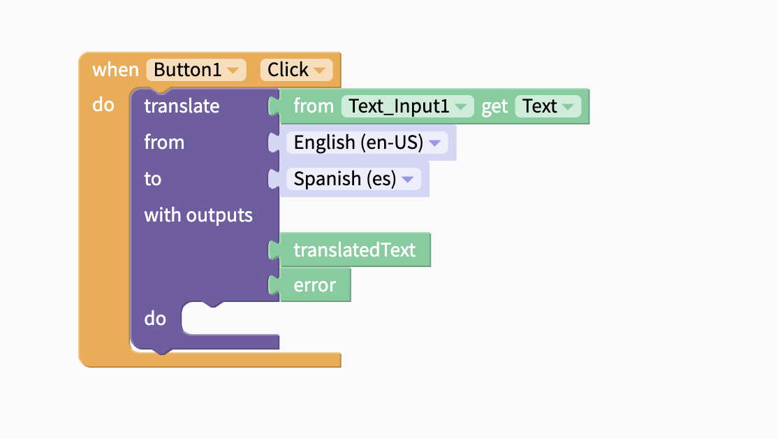
In the current version, you need to add 4 components to your design, then in the blocks you’re expected to understand that function blocks can/should be nested and that the “result” variable from the Translator should be passed as the input to the Text To Speech component:

That’s quite a lot if you don’t have any experience with coding. With this update you only need two UI components, and the new blocks read more naturally and intuitively. You translate the text, the translation gets passed to the TTS component. Simples!

Tasks that were previously done in the designer, such as setting the language, are now done directly in the blocks so there is less context switching between the Design and Blocks tabs.

When you’re ready to move to more complex ideas, like asynchronous blocks, then there are some alternate “Advanced” blocks that you can use. For example, the translator can work in-line like this (which is how the vast majority of you use it at the moment)

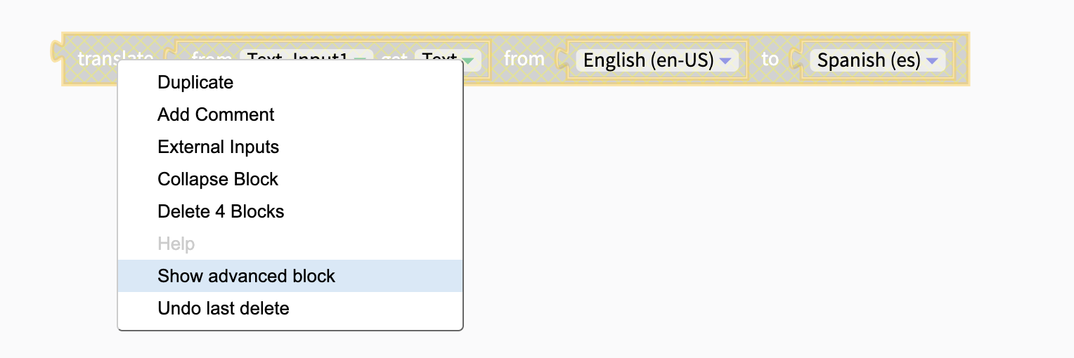
Or it can be set up in advanced mode like this if you need access to additional functionality like error handling.

Finally, the settings for the components formerly-known-as “invisible components” can now all be done directly in the Blocks Editor. Simply click on the gear icon to add your own settings. You can connect to multiple APIs, work with numerous Alerts and even add Push Notifications and AdMob ads without ever having to leave the tab you are working in.

This improved method of adding component settings will also enable us to give you more granular control over your final app settings - another request that we’ve heard many of you asking for.

Ok - there’s a lot to digest in that update. Please take a look at the beta features in your account, test out the new blocks and leave us your feedback.

9 Likes

Very nice! :clap:

1 Like

Thanks @Deluxe - is there anything in particular that you really like about this?

@domhnallohanlon

Defintely a big improvement. A shorter layout designer list is great. The block screen ability to collapse the UI component list is super handy too.

A few tweaks I’d like to see (or at least request):

  1. Move Core blocks above the UI components. They are the core blocks, right?
  2. Move the invisible components (firebase, airtable, etc. ) out of the UI Components section into the App Features section. They are invisible right?
  3. Some way to sort/group/filter by UI Component Type. When changing the TextITems property for a list viewer, I hate that I have to scroll through all of the labels, text boxes, switches, etc.).
4 Likes

Thanks for the helpful feedback @drted!

Interesting - do you use these blocks more often that your own UI components? And, related, as a brand new user, if the first thing you saw was the “Control” blocks, rather than the “Screen1” blocks would that affect your understanding of the Blocks Editor?


They are - and they should be there. Are you working from a legacy project?


At the moment they should all be in the same order that they appear in the component tree, again, assuming you’re previewing this with an existing project?

@domhnallohanlon

  1. I’ll defer to you on the NEW USER experience. You work with them more than I do. My apps are very data intensive, so I have a ton of logic, loops, variables, and function calls. Maybe I’m an outlier…
  2. I’m not sure what you mean by “legacy project”. If you mean a project I created BEFORE this roll out, yes. I just turned on the switch in my profile settings and the new block navigator appeared.
  3. Yes, that is the order they appear. Some of my screens have dozens of controls (data intensive apps) which makes the list quite long. Because there are so many controls and scrolling to find them in the block list involves lots of scrolling up and down and up and down, I generally just copy another block. Which saves me some scrolling. But then I want to change the block to reference ListView_2 instead of ListViewer_1. I just wish the property blocks had UI Component specific list (i.e. Label blocks only list label UI Components, button blocks only list Button UI Components, etc.) Again, perhaps I am an outlier with my data intesive apps, complex forms, and multitude of screens.

Great decision by the team. Makes a lot more sense to have the blocks this way. :clap:

1 Like

Very very nice UI. The user interface has been cleared off finally, which makes finding exactly what you are looking for very quickly, with both the new management (new UI) and visualisation of the components in the blocks section.
Very helpfull especially when a project is getting bigger and more complex.This feature will greatly rest our eyes :wink:
Keep up the good work guys :+1:

1 Like

I second that :+1:

What if I want the firebase DB And Firebase authorization. Where do I get it I looked everywhere didn’t find it…

1 Like

Wow! This is a great improvement @domhnallohanlon. It’s been a big struggle to constantly navigate between the design and blocks tab to change settings of components. Thanks very much for adding this and making my Thunking easier.
Some improvements I would like to suggest:

1: It would be great to change the setting of the visible components for UI (button, label, etc) from the blocks editor. Currently, you can change the settings of invisible components, like the URL of a WEB API from the blocks area. It would be really helpful to be able to change properties of visible components as well. For example, you can change the text color of a label or border radius of a button from the blocks editor. That would make Thunking much quicker and faster.

2: It would be wonderful to be able to see positions of visible components in the blocks editor. When I code, I keep forgetting what each component is even though I give each of them an ID. For example, if my screen has a lot of components like date input, many labels, and other UI components, it would be confusing to keep track of all my components. A possible solution is to have a screenshot of the block in its position along with related blocks and settings. This would also save me time from going to and fro from the blocks tab to the design tab, and back again.

3: It would be great to be able to add ‘comments’ to components, so we can know what each button is doing in the app, when we are blocking it out. For example, if I have a lot of buttons like ‘Listen button’ and ‘Stop button’, and I’d forgotten to which button did what, it would be helpful to have comments that you can add to each component (which will be visible only to the creator and not the user) that will remind you what each button does. If this comes up, then I will be able to click on button Listen’s drawer in the blocks editor and read what I have written about the button’s function, like ‘This is the block that will play the music that the user has selected’.

Overall, though, this is an amazing improvement, and I hope many more keep rolling out.
Thanks,
@codeswept

2 Likes

i cant see bars like this

@eko.devs.apploroceo - did you go to your features page and opt-in to test this feature?

Hey @abdallask - I can see the Firebase Auth component in my blocks:

Screenshot 2020-11-17 at 11.02.08

I’m looking into the RealtimeDB for you.

thanks i got it
thanks for the update
:smiling_face_with_three_hearts:

2 Likes

In the App features tab I only have 4 components, Why?

What about old apps designed already in Thunkable X? Will they work when this new UI is rolled out? Will they be converted to this new UI? Wouldn’t want to build everything from the scratch…

Would be nice if you could clarify this. Thank you!

Are you working on an old project @abdallask? Can you share a screenshot?


Good question @ethosworkfi - this is a non-breaking change so you can toggle back and forth between the old editor and the new editor right now in the same project.

Let us know if you find anything that needs our attention!

Nice, good to hear! By the way, just a quick question, didn’t have time to try it out yet by myself, does the new editor somehow keep the old blocks and present them in a new way? So might it make sense to start using the new editor with old projects, or is it just impossible?