Hi, I’m trying change the image of my list viewer - to give it some texture rather than just a flat background colour. Currently I don’t see a way to add any background image the same way that an image can be added to a button. So, the idea I have is to put an image in the exact same location as the list viewer and set the list viewer background to transparent so that it appears above the image. But I’m not sure how to do that overlay either… is it possible?
Hi @freddiedadog,
Are you referring to the new Extended List View component?
I’m not really familiar with what that does, but just reading it seems like it’s probably more complicated than what I need. I’m just trying to change the look of the list viewer to make it a non-flat button…
Do you have and mock-ups or references for what this would look like @freddiedadog?
Do you want one image behind the entire list viewer, or would each item have an image behind it?
I do, but I’m having problems uploading the image (access denied).
Just one image behind the entire list viewer. Looks something like an iOS scroll wheel with a bit of 3d feel to it.
@freddiedadog as a temporary solution use snipboard.io to upload screenshots 
Using standard ListView:
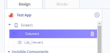
Add a Column to your screen, followed by the List Viewer component which should be child of the Column. Should look something like this:
I then went and changed the background of the Column to a picture of a cat:
Result:
Hopefully this is what you meant? If not be sure to let us know.
check this one out!
https://x.thunkable.com/copy/e97515d33916693d25cac0dd71cdf634
@eoinparkinson - Yes, that is what I want. Except I’m looking to only do a small button, not the whole column, so I tried to insert a row under the column and then load the background picture onto that row (and the list viewer is a child of that row too). Challenge is that the image and the list viewer aren’t aligned, there’s still a vertical separation.
@jared - Yes too! But I don’t know how you did that. Something to do with absolute and zindex? If I set it to an absolute position, does that mean it won’t adjust dynamically if the screen changes? Eg. If switching from iphone to ipad, would it work for one and not the other.
For reference, this is the code I’m using:
https://x.thunkable.com/projects/5ea1a6984e9cae3295ee198b/0736de48-943e-4be4-bf40-6346716c2636/designer
absolute positioning when using % works fine. if you set px, that will not translate well between devices.
I think there may be videos about that on youTube
Thanks! I just checked out youtube, but can’t find a tutorial to help me understand how absolute positioning and z-index works. Is there some documentation somewhere that I could refer to?
You can start here.
(@actech’s website)
i will post more later
basically: z-index = front to back placement of components.
(more to come)
I see. Ok I’m playing around with it now. It’s helping.
But I still can’t get the list viewer and the image to align vertically. And also when I put two of these list viewers together on adjacent rows, the images end up overlapping.
do they align in the shared project?
In the one you shared? Yes, they do. In that one both the list viewer and the image fill up the container. That’s what I’m trying to achieve too, except with a smaller container, constrained by a column and a row under it.
check out how i made it here
Thanks!! I’m going to need some time to work through this and I’ll let you know how it goes!
It worked! Thanks!!
In the end I ended up setting height and width to relative and 100% rather than fill container, and that managed to ensure the image and listviewer filled up the column (row) without misalignment.
Thanks for following up @freddiedadog
I’m going to mark this as #solved so if Jared’s answer was the solution for you.
Please feel free to #ShareYourApps with us, both here and on Twitter, when you get it finished.


