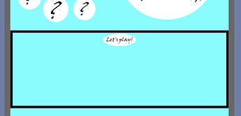
Changing width to 100% instead of fit contents causes “lets play” to stay in the middle, although it is tiny if I have the “when clicked” block (even with nothing in it).
I thoroughly agree that it seems improbable that this block would change the layout, and yet, I’m sitting there with the live preview on, watching it reload, and it really is. Interestingly, if I change the “when clicked” block to the top image, that image gets inappropriately huge, and let’s play goes back to the right size. Weird, but really, that /is/ what’s happening.
That I can’t figure out. But if you add a border, you can see that the component actually doesn’t change size at 100% relative width. The picture does:
hi @catsarisky
i really dont know how or why this happening for your image or wish options you used for it
but i tried with a new image and its working good
can you please try this remove the image from your project and put a new one then use this options
Dont forget to remove the old one first
i think its a issues … because the issue show up when you use the Fill Container and When image click block together but if you will use the Absolute size its will working good
I think that the image you used is a bit small. Why not try twiddling with the Picture Resize Mode properties?
Here’s mine. I’m uploading video, because the web previewer is sort of eating my header. Thunkable
Thanks to everyone for the advice on getting images lined up. I didn’t get things 100% perfect, but I got it looking pretty good on my teeny phone and the iPad. (Correction: something I did at the end changed how things line up on the iPad a bit. Well, I wanted to redo that part anyway.)
I had questions and URLs in an airtable spreadsheet. To reduce lag between questions and answers, I grabbed ten questions (all unique) out of the Airtable DB into a local DB while on the first screen, then walked through them in order.
Thanks to @domhnallohanlon for the fun challenge! Can we do another soon? 
@catsariskypbi Very nice! And educational, too.
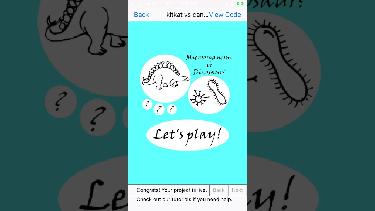
Amazing! I was stumped on all of the questions when I tried to play along with the video. I especially liked the right/wrong message, the images of the microorganism/dinosaur, the learn more button, and the right/wrong colors.
Wow - so impressed by the creativity here @codeswept, @tatiang and @catsarisky
Here’s my version (which is just a re-make of the original)
https://thunkable.site/w/U4KSwtk6H
remix link and tutorials coming soon!
Amazing @domhnallohanlon ! Just one problem, though- the candle image is not showing up.
yikes! what browser are you using?
Also, I’m getting questions repeated. If it’s a list, it would be much better if it’s get and remove instead of get. I got the same question 3 times in a row!
Ahhh I’m in awe at the crazy cool amount of new games you’ve made!
I think this is my favourite out of all of them. I like the educational bit too. (I got 9/10 on the game  )
)
Aww, thanks for your kind words @devopstom !
Thanks a million Tom.
Just as an FYI for the rest of the Community, I’ve posted about all these fantastic apps on Twitter here:
Cool! @tatiang and @catsarisky I loved your versions! They were all really creative!
Updated my app today, to include Hufflepuff vs Ravenclaw, and All the Houses. I’ve also slightly improved the UI and layout. Even if you don’t know much about Harry Potter, please try and test the app here, and suggest improvements for the UI/UX.
Wow - this looks great (loved the puns too!)
Feel free to post in #shareyourprojects as well if this is a project that you might update again in the future, that way everyone can stay up to date with your progress/new releases!
I never finished this challenge but I do have a playable demo. It eventually runs out of animals and says “undefined” and the timer doesn’t work. Plus, the sounds are obnoxiously loud!
But… enjoy:
https://thunkable.site/w/gZpIQb0T_


 )
)