Hi Thunkers,
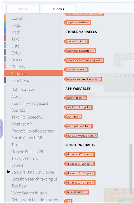
I don’t know about you, but for me, after you created a long list of variables (app or stored), starts to be annoying search for a specific variable in the lists, because the block editor keeps them ordered by creation.
Before submit this suggestion (to sort and order alphabetically), I want to ask if there is any “hidden” configuration to do it, or if you agree that this can be improved.
Please give your opinion on the pool below:
Do you prefer the variables list in block editor sorted by:
By creation order (as is today)
Sorted Alphabetically (more easier to locate in long lists)
Regards!
Paulo Vaz
jared
December 14, 2021, 3:35pm
2
Maybe there are other ideas in the crowd as to how we could better present a long list of variables to the user?
Any designers our there wanna jump in on this discussion? We love to hear community feedback!!
tatiang
December 14, 2021, 3:40pm
3
I had some suggestions here:
opened 02:04AM - 13 Nov 20 UTC
enhancement
**Is your feature request related to a problem? Please describe.**
I've always … been a little confused about how variables are sorted in the Blocks tab. It seems like they might be in alphabetical order or chronological order (as created) or by type... it's never clear to me.
**Describe the solution you'd like**
I can think of a few improvements: (1) a text list that's accessible somewhere in addition to the blocks; not quite sure how that would work or how you'd modify variable names (2) the re-design example shown below in the first mock-up, where variable types have section headers. Note that I didn't take the time to ensure that _only_ stored variables appear in the STORED VARIABLES section, etc.
There should also be a section for loop variables (i, j, k, etc.) and probably other sections I haven't thought of. See the second mock-up below.
It would be amazing if variable types were offset somehow maybe with a slightly lighter color so that "app Score" highlighted the word Score and it was easy to find in the list of variables. The word "app" is so less important in the context of quickly visually scanning for a variable name. The names of the variables could be left justified so that "app" or "stored" or "cloud" hangs off to the left in the margin but the unique names are all aligned vertically.
**Describe alternatives you've considered**
Would be great to have someone explain the current sort method. 👍
**Which platform are you asking for?**
Thunkable ✕ (x.thunkable.com)
**Additional context**

<img width="200" alt="Screen Shot 2020-11-12 at 8 50 30 PM" src="https://user-images.githubusercontent.com/10355498/99029960-b9241000-2528-11eb-8fbf-f49a246aafdc.png">
Note that this was before the word “variable” was added to every single variable block which I think makes them unnecessarily long. The color coding should be enough (function variables are just displayed as “i”, not as “function variable i”).
Yes, I see your idea to split by type, but anyway, the alphabetical sort will be very welcome in addition to this, don’t you agree?
In large apps that manipulate lots of variables, really sucks search where the variable is on the list…
Let’s hope the staff change this soon!
tatiang
December 14, 2021, 4:34pm
5
Yes, I would prefer alphabetical sorting of variable names.