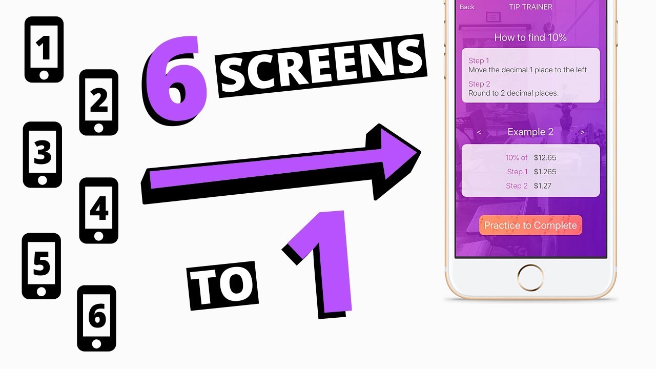
Hello, all. In an effort to minimize the number of screens in my project, I want to add functionality of several functions in one screen. From my dashboard I would like that screen to open with the component relating the the button they clicked. For instance, click button Red, the screen would open with a red background and a few rows and labels. Click button Blue and the screen would open with a blue background and so on. I don’t see a way to get this done. Is there a tutorial I can look at to resolve this problem?
Hey @bobbyj12, there are a few Youtube videos about this
I use this concept for my main project. There are many settings, meaning many different configurations for the main screen.
here are a few examples of sets of blocks to help accomplish this task.
These blocks come from an almost fully dynamic screen.
Hey @bobbyj12, I’d agree with everything Jared has suggested and add this one as another resource you can use:
I condensed my app to 3 screens from 7 screens, splash, login, and dashboard. All of my other screen components are now on my dashboard screen. they all seem to be working fine except my fill container only seems to fill half the screen. The way I have it set up is I have 1 column for each function (i.e. todo list, records, documents). When one function is visible all of the other columns are not visible. Even though they are not visible, they seem to be occupying the space are the bottom of the screen and this is forcing the visible component to take up only half the screen. What can I do to make the column “Truly” not visible?
Can you post a screen shot of what you mean?
The full screen is full because I deleted the columns I created for other components. Only the dashboard column exists.
this probably isn’t a perfect workaround, but if you make the column backgrounds clear or the same blue? would that work?
are you looking ot have an effect like this?

I actually just recieved FB from one of my app users. they are using a Galaxy 6/7 (they werenn’t sure) and these animations run very slowly on their phone. Also they get this weird thing on this screen that you wont see at the top of what i shared above. these are from the same build number howver my screenshot above is from an iPhone 11
this is from a galaxy 6/7. just below th ebanner you can see text and a blue bar that should be hidden until “edit/set names” is clicked. on all iPhone builds this is hidden, on all androids it appears.
@Mark or @domhnallohanlon do either of you have any input on how to improve these issues? Remove animations? even the hide/show rows is slow. i’m not sure why. i think it’s because i paint the buttons each time they are displayed or clicked on but i’m not sure if this would produce the slowdown.
is anybody interested in checking this out and reporting back with FB?
I can’t seem to be able to open each column without the space occupied by the non visible column crunching down the visible column. I might have to go back to multiple screens. I think this is a bug in the X platform.
@bobbyj12, if you move to a completely dynamic app they’re shouldn’t be a need for multiple columns like this.
All you’d need to do is swap out the contents of your labels and not worry about showing/hiding columns or other components.
Hey @bobbyj12, I just created this tutorial video for how to create dynamic screens and saved a copy in my Sandbox App. this will be more specific to your use case than the video posted above.
https://x.thunkable.com/copy/c1f1ab923da6a913154ca52e9e4d78ec


