Hello all,
I am attempting to make a ‘get’ call using the webviewer. at the bottom you will see the encoded url i am using. when i insert this as the url in the design screen, the result appears on the design screen, working as expected. Howver, when i try the app in live preview and on my phone,i get no response.
I don’t even need the encoding until I throw in the callback function at the end to modify the tickmark labels. It’s weird.
image component also doesnt do this. does anybody have any suggestions?
the two url’s below are the same, btw
https://quickchart.io/chart?width=300&height=200bkg=white&c={
  type: 'line',
  data: {
    labels: ['January', 'February', 'March', 'April', 'May'],
    datasets: [
{
      	label: 'Corrects',
      	data: [ 10, 60, 70, 180, 190 ],
	fill: false,
	borderColor:'green'},
{
    	  label: 'Incorrects',
     	 data: [ .10, 20, 30, 40, 50 ],
	fill: false,
	borderColor: 'purple'
    }]
  },
  options: {
    	title: {
     	 display: true,
      	text: 'SAFMEDS',
      	fontColor: 'blue',
      	fontSize: 32,
    },
    	legend: {
      	position: 'bottom',
    },
    	scales: {

      	yAxes: [{ type: 'logarithmic',

        	ticks: {
        	autoSkip: false,
        	min:.001, max: 1000,
        	callback: function (value, index, values) {
            if( value==.001 || value==.01 || value==.1 || value==1 || value==10 || value==100 || value==1000){
            return value + ' per minute';
            }
            }, }
      }],
    },
  },
}
https://quickchart.io/chart?width=300&height=200bkg=white&c=%7B%0A%20%20type%3A%20%27line%27%2C%0A%20%20data%3A%20%7B%0A%20%20%20%20labels%3A%20%5B%27January%27%2C%20%27February%27%2C%20%27March%27%2C%20%27April%27%2C%20%27May%27%5D%2C%0A%20%20%20%20datasets%3A%20%5B%0A%7B%0A%20%20%20%20%20%20%09label%3A%20%27Corrects%27%2C%0A%20%20%20%20%20%20%09data%3A%20%5B%2010%2C%2060%2C%2070%2C%20180%2C%20190%20%5D%2C%20%0A%09fill%3A%20false%2C%0A%09borderColor%3A%27green%27%7D%2C%20%0A%7B%0A%20%20%20%20%09%20%20label%3A%20%27Incorrects%27%2C%0A%20%20%20%20%20%09%20data%3A%20%5B%20.10%2C%2020%2C%2030%2C%2040%2C%2050%20%5D%2C%20%0A%09fill%3A%20false%2C%20%0A%09borderColor%3A%20%27purple%27%0A%20%20%20%20%7D%5D%0A%20%20%7D%2C%0A%20%20options%3A%20%7B%0A%20%20%20%20%09title%3A%20%7B%0A%20%20%20%20%20%09%20display%3A%20true%2C%0A%20%20%20%20%20%20%09text%3A%20%27SAFMEDS%27%2C%0A%20%20%20%20%20%20%09fontColor%3A%20%27blue%27%2C%0A%20%20%20%20%20%20%09fontSize%3A%2032%2C%0A%20%20%20%20%7D%2C%0A%20%20%20%20%09legend%3A%20%7B%0A%20%20%20%20%20%20%09position%3A%20%27bottom%27%2C%0A%20%20%20%20%7D%2C%0A%20%20%20%20%09scales%3A%20%7B%0A%20%20%20%20%20%20%0A%20%20%20%20%20%20%09yAxes%3A%20%5B%7B%20type%3A%20%27logarithmic%27%2C%20%0A%20%20%20%20%20%20%20%20%0A%20%20%20%20%20%20%20%20%09ticks%3A%20%7B%0A%20%20%20%20%20%20%20%20%09autoSkip%3A%20false%2C%0A%20%20%20%20%20%20%20%20%09min%3A.001%2C%20max%3A%201000%2C%0A%20%20%20%20%20%20%20%20%09callback%3A%20function%20(value%2C%20index%2C%20values)%20%7B%0A%20%20%20%20%20%20%20%20%20%20%20%20if(%20value%3D%3D.001%20%7C%7C%20value%3D%3D.01%20%7C%7C%20value%3D%3D.1%20%7C%7C%20value%3D%3D1%20%7C%7C%20value%3D%3D10%20%7C%7C%20value%3D%3D100%20%7C%7C%20value%3D%3D1000)%7B%0A%20%20%20%20%20%20%20%20%20%20%20%20return%20value%20%2B%20%27%20per%20minute%27%3B%0A%20%20%20%20%20%20%20%20%20%20%20%20%7D%0A%20%20%20%20%20%20%20%20%20%20%20%20%7D%2C%20%7D%0A%20%20%20%20%20%20%7D%5D%2C%0A%20%20%20%20%7D%2C%0A%20%20%7D%2C%0A%7D%0A


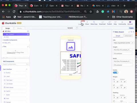
Here is what they look like without the callback function. It’s messy.


