I’m having issues with layout in an app I’m building with the kids I coach. I’ve built a minimalist example that illustrates the problem here: Thunkable
UPDATE: I can reproduce the problem even without switching images, as shown in post #6 (below). It’s a problem with setting height to “fit contents” for an image. Does no one else want their images to be full width and the ‘right’ height to hold the image?
Original post continues below:
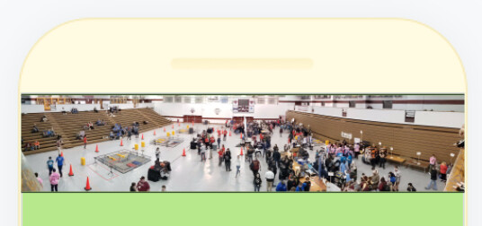
Basically, the layout switches between images, which are different sizes. Each image needs to be at the top of the screen, without a bunch of extra padding. Here’s what I get in Thunkable Live (on iPhone). The webviewer result is similar. The yellow is the column containing the image and buttons below it. The red is the border on the image. The actual image is the dragon/balcony with the black outline showing the actual image border. The extra padding appears both above and below, but I’ve got padding and margins set to 0.
And here’s how it looks on my design screen - I’m not coding extra space!
A few settings that might be relevant:
COLUMN: height is set to fit contents. The width is set to 100%. Vertical alignment is set to top.
IMAGE: Picture resize mode is contain, height is fit contents, width is fit contents. In the advanced tab, sizing is set to flex, maxWidth is 100%, and maxHeight is 80%.
Can someone help me understand what I’m doing wrong, and better yet, how to fix it?
Thanks!
–Cathy
I tried removing the column and just putting images in the screen itself. No improvement, but I did make it even simpler (and broken)!
This appears to about 95% fix my problem, BUT it’s a choice between a long enough lag that the resize is really obvious, or the resize sometimes not happening. Better ideas?
You know, I checked out your minimal project and I can see the problem but I don’t know how to fix it. There’s nothing obvious – to me – causing it. And yet it persists.
Well, I guess I’m glad it isn’t just me, but umm…
So I’m continuing to be frustrated by this. I have a bunch of images. I’d like to put one on a screen and have it be 100% of the screen width and whatever height corresponds to the scaled image.
Short of determining the dimensions of every image and using that to manually set absolute heights, is there a good way to do this?
I thought the problem was that I was changing images after the screen loaded, but I can reproduce the problem by dragging a wide image onto an empty screen, setting height to ‘fit contents’ and width to 100%. It looks fine on the design viewer, but like this on Thunkable Live and the web preview:
For both, you can see (different but wrong) extra height added to the image.
Is there a better way to do this? How are others getting responsive design if setting height to a relative amount breaks the way the image displays?
I thought maybe I could solve my problem with the drag and drop interface, but I don’t even see a way to make an image set to the screen width, so I guess not?
I don’t know how helpful I can be but what does the original image look like that you’re using? Are you able to share a link to the project? I’m curious what background picture resize mode(s) you’re trying.
https://x.thunkable.com/projectPage/605a2f021a0f0500115dce26
^^ simplest project ever, but it shows the problem. Picture resize mode on the image is set to ‘contain’. There’s no background picture resize mode set on the screen, because there’s no background picture.
That image is 2048 x 416 pixels originally. When the width gets resized to fit my 320 pixel screen, somehow the height ends up wrong…
Correct me if my math is wrong but if you take an image that is 2048 x 416 and shrink the width (2048) to 320, the height should be 65. I set your image to absolute size at 65 height and 320 width and it looks like this, not too different from what you’re seeing when it’s auto-sized:

When it’s auto sized there’s a big space at the top and bottom.
Okay, so you’re talking about the spacing being wrong, not the sizing. The image, as far as I can tell, has the correct proportions on the screen. But the margins above and below are what you’re noticing are wrong.
When I set the image you used to absolute sizes, as I mentioned, it is aligned at the top of the screen, as I’d expect:
https://x.thunkable.com/copy/e9bc8f9d000b92820b0327766c17534f
The black lines are there because it has a border or 1 pixel but if I remove that, they disappear.
Right. But I’d have expected that “for contents” for height would have the same effect. Having to set absolute sizes is a drag for a ton of images, and makes responsive design harder.
Is there a way in Thunkable to get the image dimensions, so that I can set absolute height or otherwise handle the resize myself?
I hoped that I could pull it out of the image height and width blocks, but nope, that’s wrong (which is why all that extra space is appearing, I guess).


