After publishing my app on play console without problems, apple store refuses to publish it because screens were crowded or laid out in a way that made it difficult to complete tasks. Which screen should I correct to publish it?
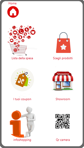
It sounds like – and this is just a guess – that they are complaining about the lack of white space on some of the screens. And possibly also images that look like they might be buttons. This screen in particular is visually overwhelming to me:
There’s so much text and duplicate text and then there are icons that look like they might be buttons. I wonder, too, if the words “home” and “menu” are necessary. But that’s a minor part.
But I’m surprised they commented on that at all. Is it possible to ask them for clarification? Which screen or which elements are they referring to?
Each icon is a button that opens a web page. How can I ask which screen they refer to? Thank you
Edit: I think I answered a question you didn’t ask but… maybe someone else will want to know this…
There really should be a green “index” block for Data Viewer Grid/List components but since there isn’t, you can do this:
The “ID” field of the data source (“Table 1”) contains the row id for each row. So when you find the first item where the ID in the list matches the row id that was clicked, you know that’s the index value you need. Then you can check the index to see if it’s 1 or 2 or 3… etc. and change screens.
Tatiang, that’s awesome, but I think the original poster wants to know what screen Apple refers to. 
Oh gosh, I totally misread that. I think you’re right. 
TGIF, right?
they sent me some screens, it seems that the problem was some buttons not visible, thanks anyway for your suggestions


