I would like to create a similar graph to this, I have created this using quickchat io by keying in the labels for the dataset and also keying in the dataset. However, for my Thunkable project, I am creating a productivity monitor which shows the estimated duration process time (taken from google sheets) and the actual duration process time to be the time output using the timer feature by storing the amount of time taken. Hence, I would like to create a graph whereby I will be able to show the estimated duration VS actual duration taken.

i don’t think you can have it live, in the sense that chart is slowly moving to the left while new points appear on the right. however you can use the technique of @tatiang and recompute the chart when you press a button marked “Chart Now”. simply replace new values in the datasets with whatever came from the stored timer captures and the durations from the spreadsheet.- for the most current time period.
- my thunkable project
![Screenshot 2021-11-24 at 6.59.18 PM|690x432] (upload://m8FTOssX1Gvaw4eW0idt4FvatvY.jpeg) - @tatiang thunkable project

![Screenshot 2021-11-24 at 6.59.18 PM|690x432] (upload://m8FTOssX1Gvaw4eW0idt4FvatvY.jpeg) - @tatiang thunkable project
Hi, I am using the drag and drop interface. However, the project that @tatiang has made, not using the drag and drop interface. Hence, I do not have the web API function the same as him. May I ask if there are any solutions to this?
sorry, the screenshot did not go through for @tatiang thunkable project.
this is his project’s version

@jared will it be okay if you look through my queries 
Have you followed along with the video series that I’ve posted?
If you follow along, you should be able to create the demo chart
Yes sir i did however it does not show a graph when I created it
If you want to share the html file you’re using, I can take a peek at some point.
for example,
<!DOCTYPE html>
<!--[if lt IE 7]>      <html class="no-js lt-ie9 lt-ie8 lt-ie7"> <![endif]-->
<!--[if IE 7]>         <html class="no-js lt-ie9 lt-ie8"> <![endif]-->
<!--[if IE 8]>         <html class="no-js lt-ie9"> <![endif]-->
<!--[if gt IE 8]>      <html class="no-js"> <!--<![endif]-->
<html>
    <head>
        <meta charset="utf-8">
        <meta http-equiv="X-UA-Compatible" content="IE=edge">
        <title></title>
        <meta name="description" content="">
        <meta name="viewport" content="width=device-width, initial-scale=1">
        <script src="https://cdn.jsdelivr.net/npm/c3@0.7.20/c3.min.js"></script>
        <link rel="stylesheet" href="https://cdn.jsdelivr.net/npm/c3@0.7.20/c3.min.css">
        <script src="https://d3js.org/d3.v5.min.js"></script>
        <script src="https://thunkable.github.io/webviewer-extension/thunkableWebviewerExtension.js" type="text/javascript"></script>
    </head>
    <body>
        <div id="chart"></div>

        <script>
var chart = c3.generate({
    data: {
        columns: [
            ['data1']
        ]
    },
    axis: {
        x: {
            type: 'category',
            categories: []
        },
        y: {
            max:100,
            min:0,
            padding:0
        }
    }
});


ThunkableWebviewerExtension.receiveMessage(function(message) {

var thunkData = JSON.parse(message);

var xValues = thunkData.xvalues;
var yvalues = thunkData.yvalues;
var chartName = thunkData.chartName;
var chartMax = thunkData.max;
var chartMin = thunkData.min;

chart.load({
    columns:[['data1'].concat(yvalues)],
    categories:xValues,
    names: {data1:chartName},
});

chart.axis.max(chartMax)
chart.axis.min(chartMin)


});


        </script>
    </body>
</html>
@teamzaddysn9m may I revert you back to post #4 where I suggest you use something similar to what @tatiang demonstrated and shared the project.
Yes, there is a delay but this delay is part of a second and can be a whole second or a bit over a second in slow links but this is more than sufficient for the graph you shared.
Anyway, even if you don’t see it fit for this specific purpose it is always a good idea to learn more than one way to achieve the same thing.
This just an opinion.
I’m not in my computer so can’t really post a screenshot but if you need the API component, it’s in the Advanced drawer.
@tatiang Hi i have tried to modify your project to suit my project. However I have query with regards to this part shown in the screenshot I have attached. I am unsure where the % has come up from.
Hence may I ask why is there %?

%27 is the hexadecimal (aka ASCII) code for the apostrophe (aka single quote). in this case it is used to delimit a variaible, here, it’s a date. The join block is concatenating several string segments together so if you peek at the string, the middle part will show
... datasets:[{label:'2021-11-25',data:[...
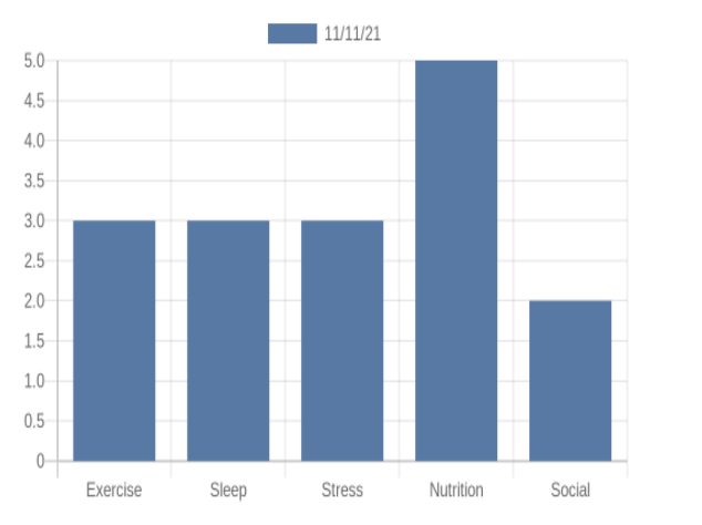
Hi, may I ask if you know how @tatiang did the graph on quickchart.io? How did he connect the graph to be able to reflect the dataset in the project? I am currently using google sheets instead of creating my own table like @tatiang Screenshot 2021-11-26 at 4.07.20 PM|634x474
The function called refresh chart in my demo is where I pull the data from the local data source. The top part of the function is where I get the specific row of data:

You could just as easily use Google Sheets or Airtable. You just connect that data source to your project and use the Data Sources blocks to pull the info you need.

Sure! First, I’m getting the row object from the data source. Because it’s an object, I have to use the get property of object blocks to retrieve individual data.
So I’m taking each property’s value (e.g. the “Sleep” value might be 3) and creating a text string separated by commas (e.g. “3,2,4,4,2”). This is just to provide quickchart.io with a properly formatted url.
An example of a quickchart.io url is:
Edit: reposting url in a different format because the forum code appears to break the one directly above this.
https://quickchart.io/chart?bkg=white&c={type:%27bar%27,data:{labels:[%22Exercise%22,%22Sleep%22,%22Stress%22,%22Nutrition%22,%22Social%22],datasets:[{label:%27Users%27,data:[120,60,50,180,120]}]}}
You’ll notice that the “data” section contains values separated by commas (120,60,50,180,120). This is basically what I’ve created using the join block in Thunkable.
Hi sorry but the website you have attached is not accessible.
May i also ask for the datas keyed in, did you manually key it in or?
Try the one I just posted in the comment above.
Yes, I manually entered the data values.