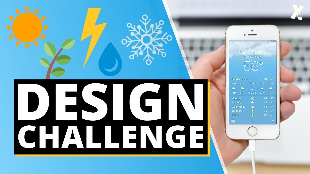
Ok, let’s mix it up this week! This time the challenge is to see if you can get your designs completed before the weekend and the topic for WDC #2 is to design a…
Weather App 
Lets take a look at some professional examples for inspiration
Weather Underground
The Weather Underground App gives prominence to the weather map and current temperature which draws your attention immediately. This is positioned below the forecast location, which is displayed in a san-serif font, and sits comfortably on the light grey background.
If you look closely, you can see that high and low temp for the day displayed above the current temperature. Below this an icon is used to quickly and clearly communicate that the weather is cloudy (overcast) and the user can also see the chance of rain with the wind speed and direction on the main screen.
Darksky
Darksky have taken a similar approach, including maps and charts in their UI. The size and central positioning of the temperature and the forecast icon grab your attention, and at the top of the screen the bold, black letters stand out against the white background.
Yahoo
You can see a much different example if you look at Yahoo Weather
They’re chosen to use a full screen image of the location and positioned temperature and forecast data in the bottom left of the screen. The height of the slender temperature digits makes them easy to read, and icon are used to identify the forecast, the min and the max temperature for the day.
Over to you!
Now it’s your turn - what information do you think is most important to display, where would you position it and how will you style it?
Looking forward to seeing your designs!


 Love this design ! Well done.