Hi @Hayder,
it qould be great if you provide more details like app screenshots in your #SuccessfullyTHUNKd post 
I have a few suggestions for your app to make it even nicer.
- add padding. The text sticks to the border of the screen/arrangement – that does not look too good. Idk if you used the ViewComponent Extension for the elevated box - in this case you could just use the SetPadding block of this extension. Otherwise you might add canvas or arrangements beside the text and set it to a nice width to prevent the text of sticking to the border.
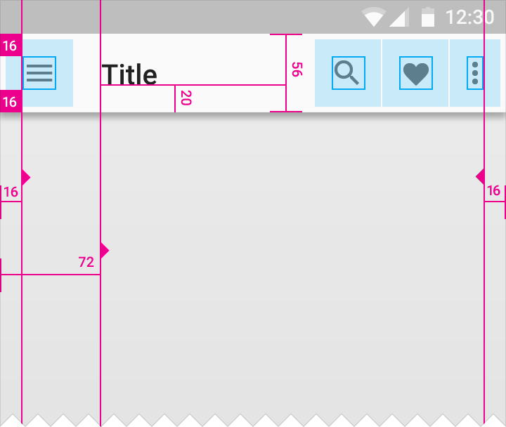
Also I would recommend to use Roboto Font in the App bar but that’s just my taste I guess…
- the App bar should always have the same height of 56dp (=56px if your app is set to responsive)
- for me when I try to change the language I just get a blank black/blue screen instead of a list:
- What I did not like is that after I entered some text for translation, I could not see the result… Even when I tapped enter on the keyboard nothing happened. That’s no good user experience - maybe try Taifuns Textbox extension to remove the keyboard on “enter pressed” event

ps: @PaserApps this is not Hayders app that you are talking about…?!
cheers, Chris


